Do you have a collection of business cards or cards lying about your home or business? Find a few of them and compare them with your own, viewing from the perspective of someone who doesn’t know your business or is looking for your services. What impression would they have?
If your cards were designed and printed by custom mail services, your cards are likely to be high quality and designed to attract your audience. But if you’ve designed and printed your own cards, or used an online service without input from graphic design services, see below for the basics of making your business cards memorable.
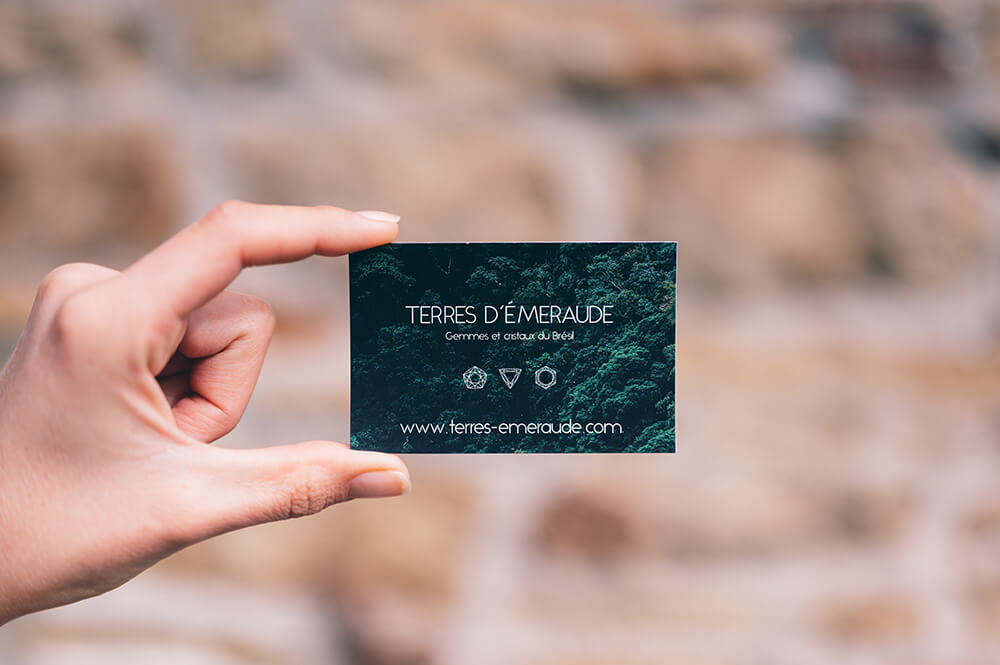
Print your cards on quality material
People noticed two main features of your business cards: the material it’s printed on and the design. The material is most noticeable once they hold the card and feel its sturdiness—or weakness. If the material feels flimsy like construction paper, the card won’t seem professional, and neither will your business.
Your card is a reflection of your business and brand, so the material should be sturdier. Cardstock and gloss cover are common choices for cards. They come in different thickness levels, but even the thinnest cards feel sturdy. The thickness of a card is expressed by points, which are equivalent to 0.001 inches. If you choose a custom mail service provider with a large selection of card materials, they can show you samples of various points, with a typical range of 11 to 30.
Cards with 11-14 points are thin and lightweight, the ideal choice for handing out at trade shows or other events. Upwards of 30 points are heavy duty cards for making a long-lasting impression, and can withstand rough handling. The thicker the card, the higher the cost, so you’ll want to factor your marketing collateral budget into your plans.
Use complementary fonts and colors
The first element of your cards people usually notice is the design. They see it before they touch it, forming a first impression of your business and presentation. If you don’t use graphic design services to portray your business in the best way, there are several features you need to consider. Two features that are sometimes overlooked are the fonts and colors.
Your card’s color design should complement your logo and fit your branding. A nonprofit might want to use gentle and non-aggressive fonts and colors, as opposed to the standout design an artist might use to demonstrate their bold style. Figuring out the ideal font and color scheme can be as simple as thinking about the emotion you want to invoke. Smooth lettering and pastel colors could work for florists, spas, or hair salons, while thick lettering and deeper colors could be ideal for barbershops and sports stores.
Other design features to consider are the overall layout: which information is included, where information is placed, if images are included, etc. Designing a business card that works and makes you happy is often a matter of tinkering. If you’re having a difficult time designing your cards, a local custom mail services provider can help you determine the best fonts, colors, and layout.
Print and Mail Services for Businesses — Bay Area and Central Coast
Complete Mailing & Printing provides a full range of custom mail services for businesses and nonprofits in the Bay Area and on the Central Coast. Contact us to receive a quote for your direct mail project, including design, digital printing, mail merging, bulk mailing, and database management.